

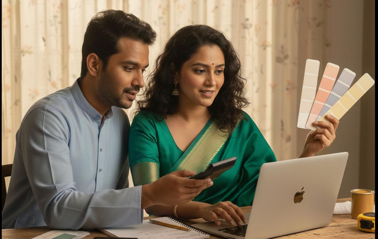
Calculate Your Painting Budget
Get an instant estimate for your next painting project
Try Budget Calculator
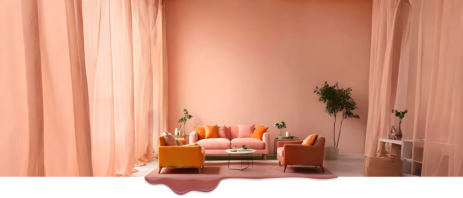
Expert Painting for Every Space
Get in touchOur Services
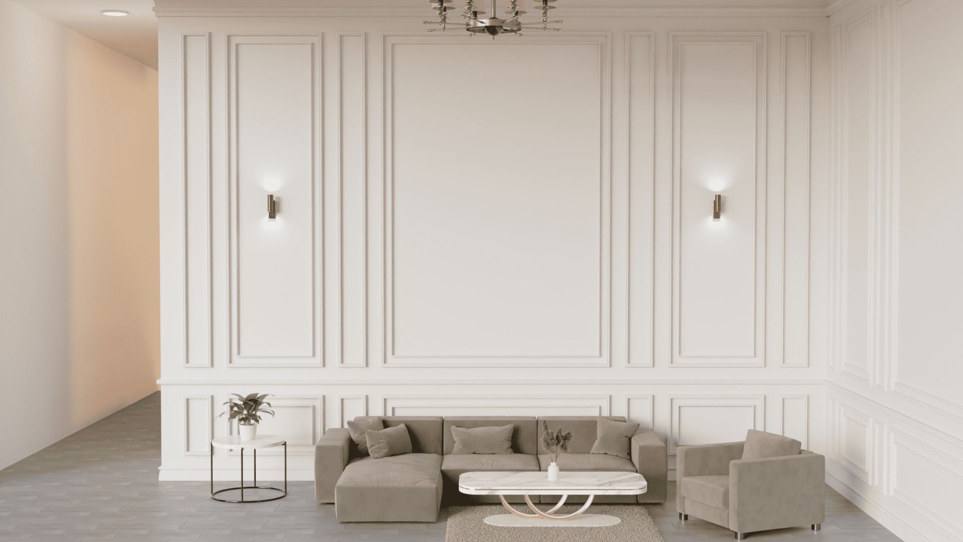
Painting Your Dreams with Every Brushstroke
Residential
Transform your home with our premium residential painting services tailored to your style and preferences.
Commercial
Professional painting solutions for offices, retail spaces, and commercial buildings to enhance your business image.
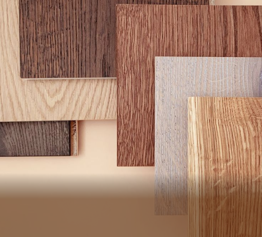
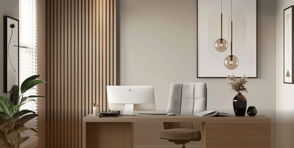
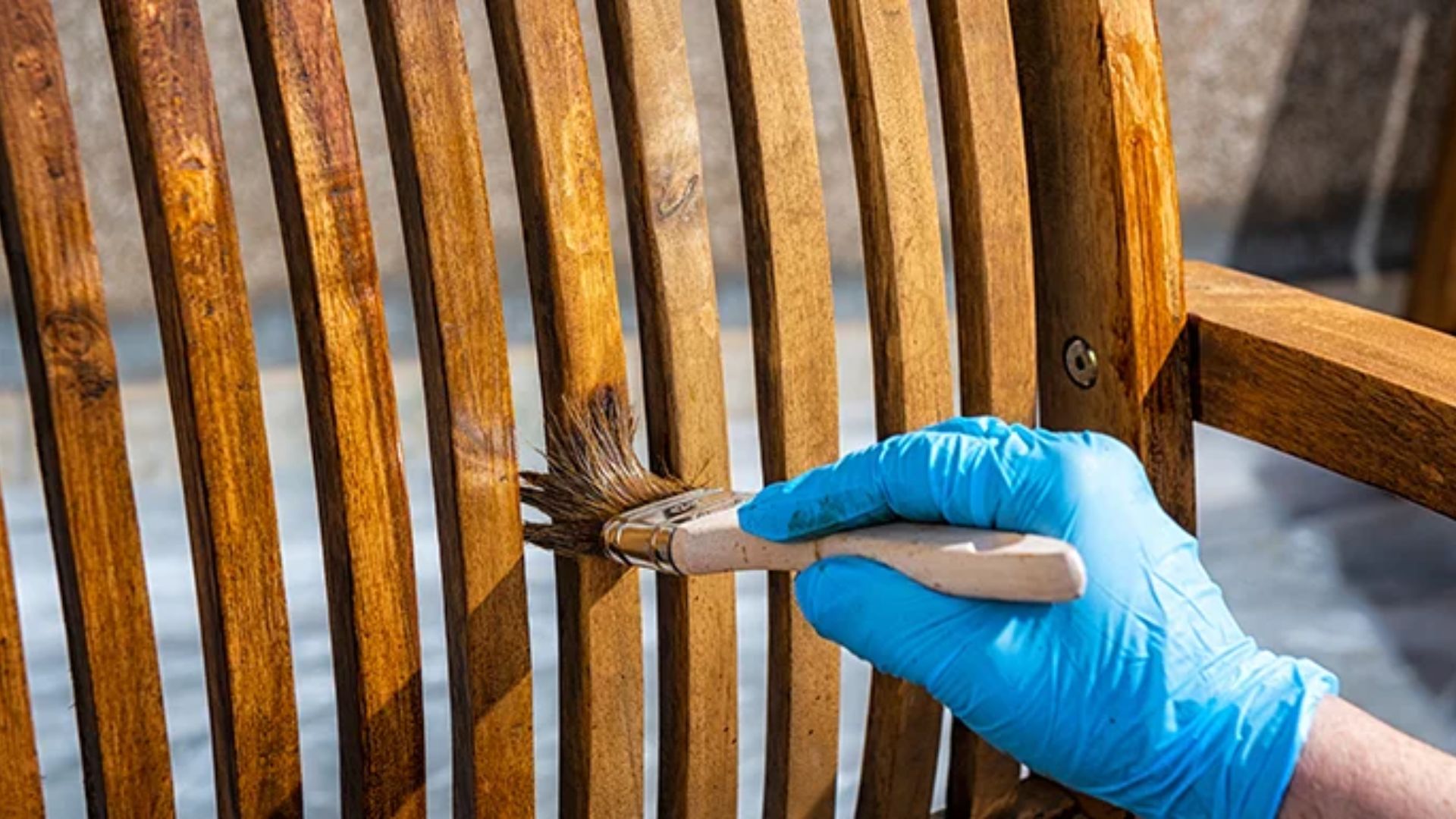
Wood Coating
Preserve and beautify your wooden surfaces with our specialized wood coating and finishing techniques.
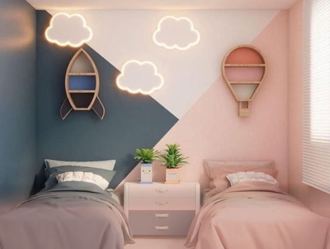
Kids Room
Create magical spaces for children with our themed designs, safe paints, and creative wall treatments.
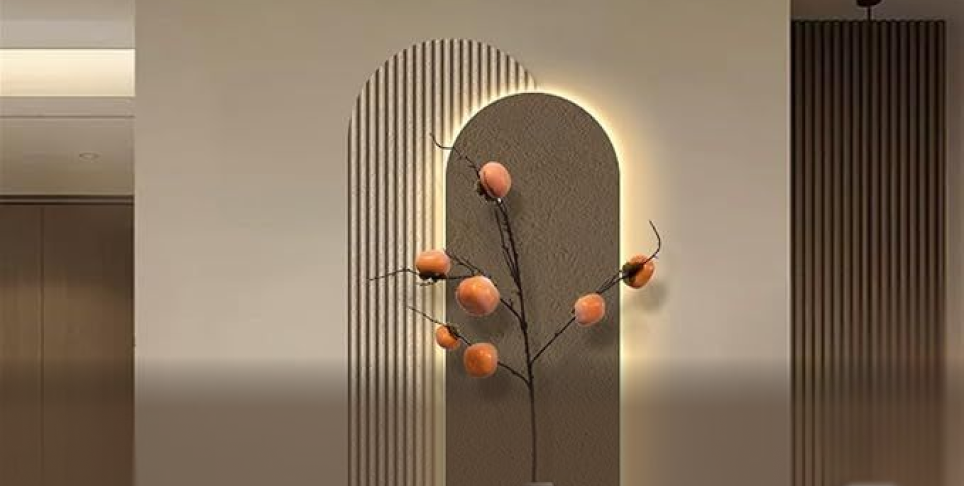
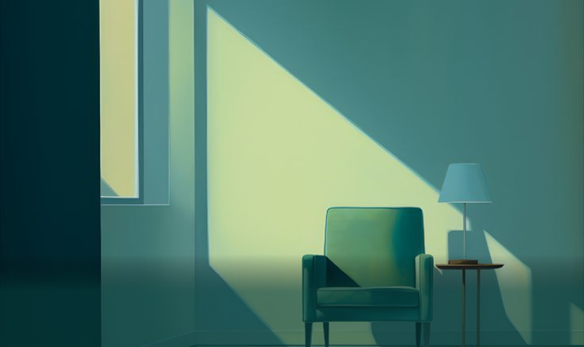
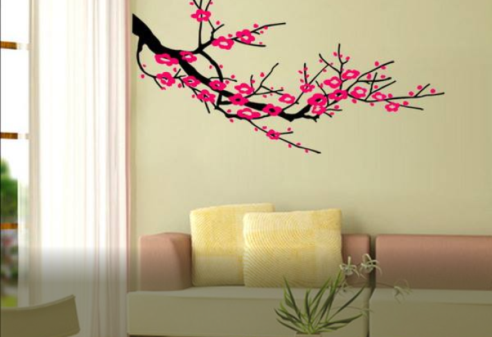
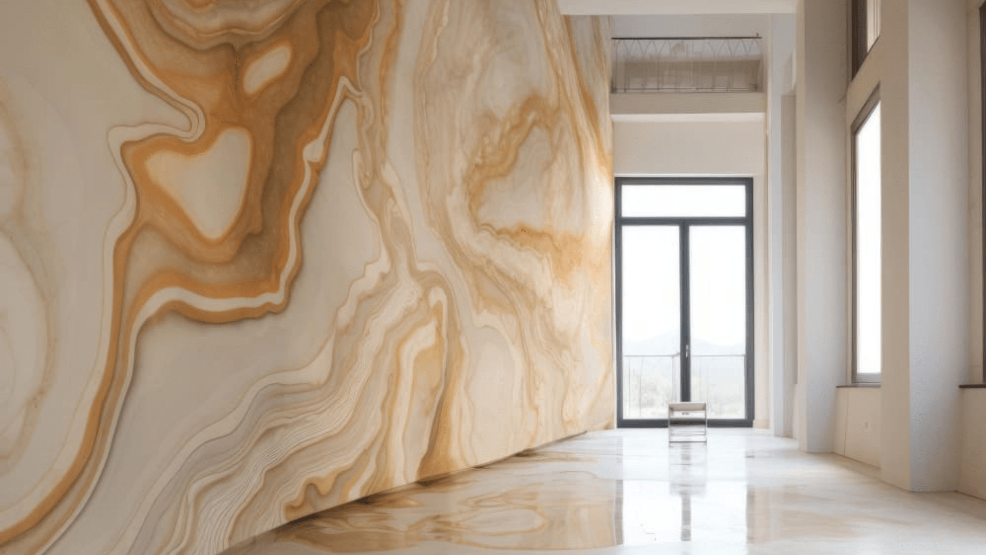
Wall Decor
Elevate your interiors with custom wall treatments, textures, and artistic finishes that make a statement.
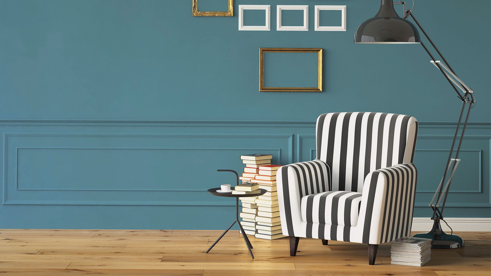
Customised Painting
Bring your vision to life with personalized painting solutions tailored to your unique requirements.
Why Choose Us?
Superior Quality & Exceptional Service

Trusted Expertise
35+ years delivering high-quality painting services.

Skilled Experts
Trained and experienced painters at your service.

Free Site Visit
No-cost consultation to help you decide.

Site Supervision
A dedicated expert to ensure smooth execution.
Make Your Home Look Beautiful for Years to Come
Every one love to spend time in a beautiful space. Painting is the most economical and fastest way to update overall look of your property especially when you are looking to accentuate the look of your home, office, shop, furniture.
Home Glazer is professionally perfect for making your house look fabulous. You can completely leave the painting services up to Home Glazer team, we are the one-stop solution for all painting services. Our services have made many clients happy over many years. We believe in quality workmanship and clients' satisfaction.
How do we do it?
Free Consultation
Talk to our experts and share your vision—no charges, no pressure.
Site Visit & Planning
We visit your space and help you choose the perfect colors.
Transparent Quote
Get a clear, upfront quote with no hidden surprises.
Execution
Our skilled team gets to work—clean, quick, and precise.

Certificates & Accreditations
Trust backed by quality standards and official registrations.


See why our clients love our services!


"We are very pleased with the wonderful paint job your team completed. The color selection was perfect, and the application was smooth and even. The painters were very professional, punctual, and cleaned up thoroughly after the job. We highly recommend your company to anyone looking for high quality painting services."

"Very Professional service. Mr. Vipin Gupta is well versed in knowledge of his field and painter also did a wonderful job. Happy with the services."
"Home Glazer was a great choice for my home painting needs and I would gladly recommend them to anyone. The customer service was excellent, the quality of their work was impeccable, and the price was reasonable. They made the entire process seamless."
"Not only was I impressed with the quality of their work, but I was also very pleased with the end result. My home looks better than ever and I am so happy with the transformation. I would highly recommend Home Glazer for any painting needs that you might have. They provided me with the best customer service and a top-notch job."
"One of the most professional and clean painting services provider in Delhi NCR. Took their service for my office painting and they did a perfect job."
Painting Blogs
Expert Tips & Trends for Your Space
Common questions
Everything you need to know, answered!
What is the difference between painting services of local painter and Home Glazer?
All paint may look the same in the can, but that's where the similarities end. If you want the best value for your money, don't let your contractor talk you into skimping on the paint quality just so they can give you a lower bid and come back sooner to paint your house again. We offer outstanding residential and commercial painting services at exceptional prices. We handle small, medium and large-sized painting projects, with work performed by experienced, fully-trained painters. With our own facility, we are the painting contractor who understand the painting processes thoroughly and know what it takes to complete a project properly, within budget, and on time. Let us put our experience and expertise to work for you.
Which brand's products Home Glazer use for painting?
We use branded products only for painting like Asian Paints, Dulux, Nerolac, Berger etc. As there are multiple brands are available in the market, we also offer our clients to choose the brand according to their preference.
How many people work on your painting crew?
The size of our crew strongly depends on the scope of work and timeline within the project needs to be completed. We usually utilize team of 2-6 professional painter to maximise the productivity.
Throughout my painting project who will be there to answer my queries?
We keep an open line of communication with you before, during and after your project. Throughout your painting project a dedicate site manager will always be there to answer your queries. You can also contact us directly to address your concerns or answer any questions you may have whatsoever.
What if I have some changes that I would like to make or additional work that I would like to have, the crew take care of while they're already at my site?
Yes, if you have any changes that you would like to make or additional work which you would like to have competed please feel free to speak to our site manager, painting contractor. In most of the cases it is more cost-effective for customers. We are always happy to accommodate your requests!